


Interactive CISA KEV Visualization
Interactive CISA KEV Vendor/Product Visualization
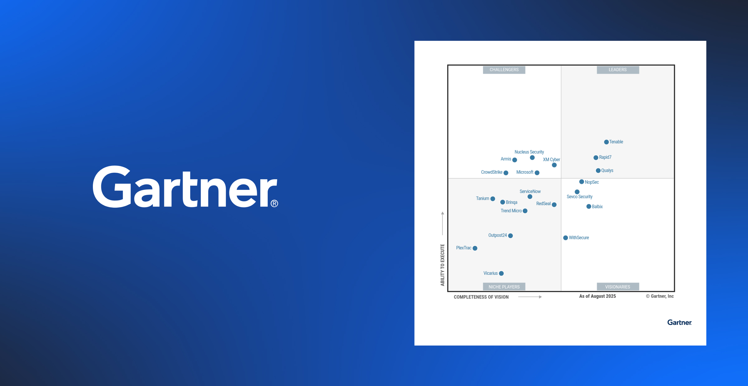
When we first built the CISA KEV enrichment dashboard at Nucleus, our goal was to gain new insights into the vulnerabilities that had been confirmed by CISA as being exploited.
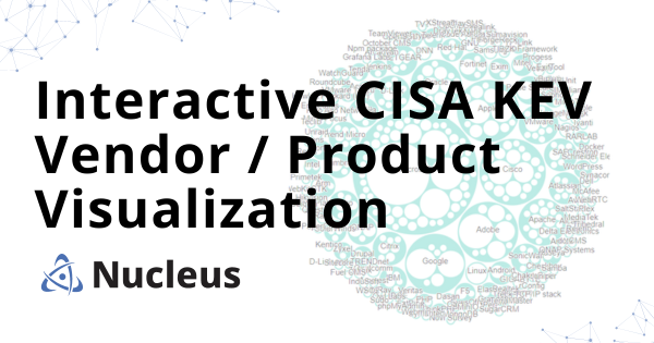
With the list of vulnerabilities surpassing 925 in total, we found it intriguing to incorporate data visualizations that would enhance the analysis of the CISA KEV data set. Among the different visualizations we had shared, this interactive bubble chart that let you look deeper into the vendors and products of the CISA KEV list caught the most attention.
This chart allows users to easily explore the impacted vendors and products listed on the CISA KEV list, providing visual learners with a clear visualization of vulnerability risk, as well as helping them identify affected entities.
This interactive visualization provides visual learners with a unique experience in vulnerability visualization that will help them quickly visualize vulnerability risk by being able to identify vendors and products that are impacted by known exploited vulnerabilities.
Go to the Nucleus CISA KEV Enrichment Dashboard
Learn How To Use The CISA KEV In Nucleus

See Nucleus in Action
Discover how unified, risk-based automation can transform your vulnerability management.

