


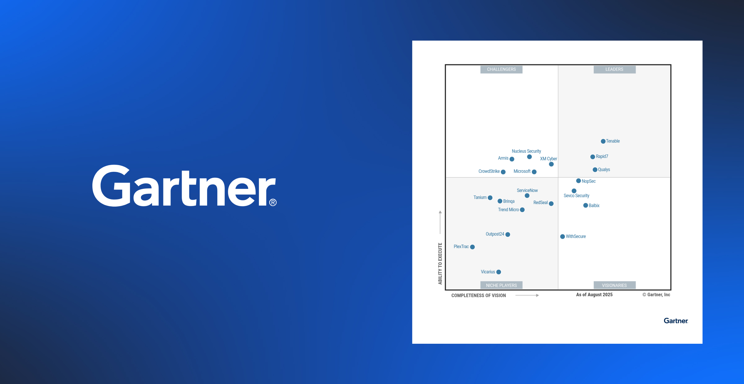


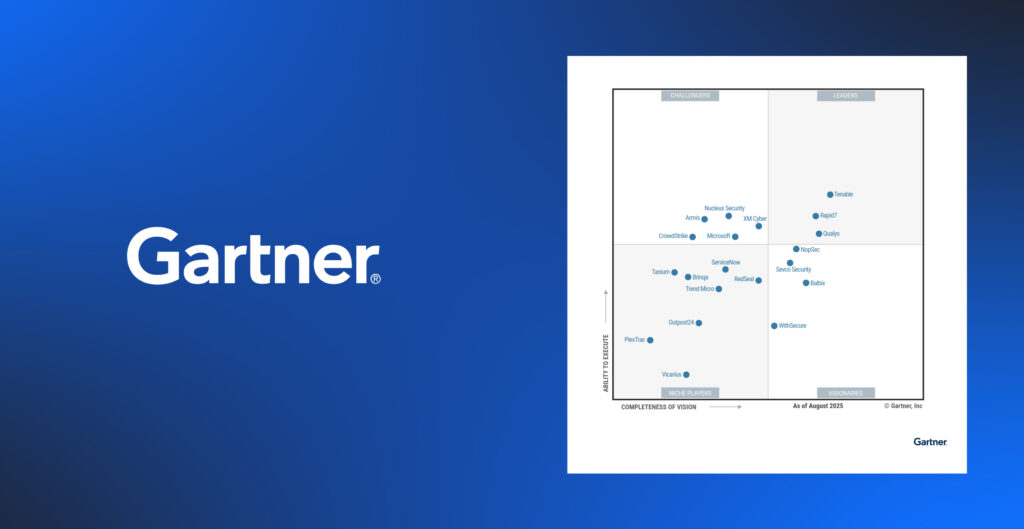


Nucleus Shortcuts: Visualizing Vulnerability Data with Patrick Garrity

Welcome back to Nucleus Shortcuts! In this episode, our host, Adam Dudley is joined by Patrick Garrity, VP and Vulnerability Researcher at Nucleus, to discuss visualizing vulnerability data. This is a special topic and an exciting one because our guest’s recent contributions in this arena have been hugely popular with the security community on LinkedIn and elsewhere. He’s a cybersecurity researcher and business leader known for his former role at Duo Security, not to mention his bowler hat and his vast collection of skateboards, some of which you can see behind him. But please welcome first time guest, Patrick Garrity from Nucleus!
Adam: Before we dive in, can you give us a quick take on how you got into security research and vulnerability data visualization?
Patrick: Flash animations were a really fun thing back in the nineties. So, I think there’s a little bit inspiration from both fixing computers and dealing with viruses when I had a computer store and was getting into the security piece of things. And then at Duo Security, I joined in 2012. That was the first like pure play security company. And I was the 12th employee and we were one of the first cloud services. One of the challenges was conveying how our service worked, because it was so foreign that people would be using a cloud service, especially for a security tool. So what I found was that we needed to address this objection in a way that people could understand without reading a 20 page manual or instructions on how to implement.
What that led me to do was essentially create a network diagram. And if you go to the Duo manual pages today on their website, you’ll find a network diagram at the bottom of every page. That really was my initial introduction into visualizing something from a technical perspective and helping people really be able to understand something and comprehend something that is rather new. And, and a lot of times perceived as complex. I have to spend a lot of time in understanding written things, so these visualizations are helpful for people like myself that maybe prefer different comprehension methods. I think a picture’s worth a thousand words certainly in helping convey things in different ways and offering different ways for people to consume.
Adam: More recently, you’ve been working on creating visualizations specifically on vulnerability research and specific CVEs especially coming from things like the CISA KEV list which we all know and love here at Nucleus. Could you discuss a little bit about what the inspiration was behind your work on this?
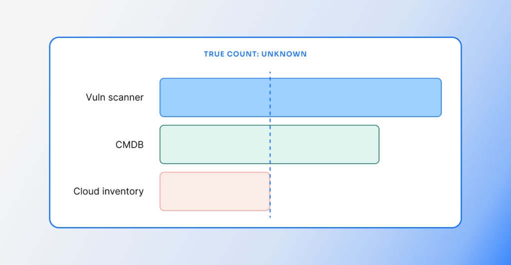
Patrick: I think a combination of things from an inspiration perspective. First off, vulnerability data is really boring, like fundamentally. Vulnerability management teams are faced with spreadsheets and there’s not much information other than like a bunch of CVEs and a bunch of table based data. And so for me, it was genuine curiosity around like, I have these list of things, there’s some exploits – exploitation is relatively new – and incorporating it into vulnerability management programs, as well and threat intelligence. And so, I was curious how many volumes are actually impacted on this giant list from the NVD. How do people make sense of this data? There’s these new concepts like EPSS and old concepts like CVSS and how do they compare and is that aligned with the CISA KEV and how does someone go about triaging this?
I think generally speaking, what I’ve learned is that vulnerability management has been mostly neglected for the better part of the last decade. I think it’s one of those things where drawing attention through data visualizations help help people understand how big the problem actually is. But it facilitates this amazing discussion around vulnerabilities, vulnerability exploitation and what organizations should be considering doing as it relates to vulnerability management. Most research that I’m doing, I will be publishing a slide version that someone can take and pull anything out of, because I’ve been asked so many times at this point, “Do you have a slide of this? Do you have a slide of that?” Really the intention with all this is, cool. I made it. But I would love for people to adopt it because it just creates different perspectives and helps enable security teams and practitioners and researchers to be able to talk about these complex topics at different levels within a organization.
Adam: Would you please spend a minute or two just giving us a walkthrough of your recent and most popular visualizations?
Patrick: So, this is one of the first examples of a chart that I created or diagram. As we can see here, it kind of explains a few different things and it resonated with people a lot. CISA – the Cybersecurity and Infrastructure Security Agency has a list called the Known Exploitable Vulnerabilities list. Right? There’s roughly 977 now, but at the time there was 925. What I wanted to do is map CVSS scoring, which is the most common scoring system adopted, and specifically the base score. There are other variants you can use from a scoring system, and what you can see here, just starting there, is these are all exploited, but they’re not all critical vulnerabilities as it relates to this scoring system. And so it kind of highlights that there’s an important aspect that you’ve got to consider as now we have access to exploit data that maybe, you know, these scoring systems aren’t necessarily the best place to start, or maybe we need to look at other, other different sources.
And there’s some things not factored in, but specifically on the right, we see a newer scoring system that is also managed by First.org, and it’s an open standard, the Exploit Prediction Scoring System. his shows the probability of exploitation and the measurements are much different between CVSS and EPSS. But, what I was trying to convey and show here is that EPSS shows a higher likelihood of exploitation and it could be used as an alternative to CVSS, but also that you shouldn’t not look at something like existing exploit data that we know has confirmed exploitation. So this facilitates a lot of good discussion. The other thing that’s not factored in with the base scores and EPSS probability is the amount of work effort for the scores.
I set the EPSS score, I just set some random scores that kind of gave it the look that it has. But the reality is, a score of 8% is equivalent of CVSS 7 from an exploit coverage perspective. So, one of the things that I’m working on in the data is explaining EPSS is probably a better place to start as it relates to vulnerability prioritization because it incorporates exploitation evidence, right? Things that are very, very high risk. So CVSS metrics are used in EPSS for predicting probability. And so these two are relying on each other in a lot of ways.
This one specifically, I took the time though to categorize the CISA Known Exploitable Vulnerabilities list into different technology types. Now, this was my work in creating these technology types, so I tried my best in the experience I have in the tech space to categorize these. So we have things like operating systems, productivity software and networks. So I can click down and I can look at what are the network devices on the CV that are known to be exploitable. And we can see here things like Cisco and then we can look at products. I’m using the categorizations from the KEV, we can look at at Fortinet and some of the different impacted products. But it’s just really interesting to be able to quickly take a spreadsheet and a bunch of tables that you can make sense of and see, oh wow, operating systems are really impacted on my network devices.
People should probably make sure they have really good patch processes in place for these technology categories and technologies, and browsers is an example here. So really the data tells a story of where high level you should be spending some of your work effort and time and making sure that you have good patch process in place. What are your escalation processes when there’s a new vulnerability or a critical vulnerability or a zero day in an operating system or a browser or your network? So people can come to the Nucleus blog and play around and interact with this in a little bit different ways than they had before. So if people want to leverage or use the data visualizations, they’re more than welcome to.
If you want to subscribe to be notified when future episodes of Nucleus Shortcuts drop or see earlier episodes, visit the Nucleus Security channel on YouTube and click the little notification button. We’ll see you soon on the next Shortcuts!

See Nucleus in Action
Discover how unified, risk-based automation can transform your vulnerability management.

